ShopDreamUp AI ArtDreamUp

Deviation Actions
Phil Cho Super Fans
52 Subscribers
Get access to exclusive artwork including sketches, inks, and high definition pieces here :)
$10/month


Suggested Deviants


Suggested Collections


You Might Like…


Featured in Groups


Description
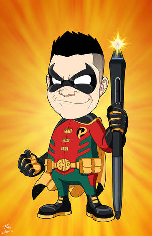
My long overdo Batman redesign. Oh mai! I've been working on college projects all week. Here's what I squeezed out within it all. <3
I borrowed several elements from my ooooollllld design ([link]), but all in all I think it's a good improvement because... no more tissue box shoes! I traded them out for tabi shoes. Bruce will always be a parkour ninja in my head. Don't know what's up with me and giving Batman layered Kevlar stuff. I think my next design will attempt to cut down on the padding, but I'll see.
I'm always raving about making a JLA comic someday, then I go and design things that are too complicated for repetitive drawing. xD BUT IF I WAS A GOOD ARTIST IT WOULDN'T STOP ME. But it does. Hnnnnnnng.
What do you guys think?") Yay? Nay? Anything you like or don't like? Yes, I'm up for full-blown criticism, even on anatomy en such.
Yay? Nay? Anything you like or don't like? Yes, I'm up for full-blown criticism, even on anatomy en such.
EDIT: NOOOOOO Y U CUT OFF, SHADOW?
I borrowed several elements from my ooooollllld design ([link]), but all in all I think it's a good improvement because... no more tissue box shoes! I traded them out for tabi shoes. Bruce will always be a parkour ninja in my head. Don't know what's up with me and giving Batman layered Kevlar stuff. I think my next design will attempt to cut down on the padding, but I'll see.
I'm always raving about making a JLA comic someday, then I go and design things that are too complicated for repetitive drawing. xD BUT IF I WAS A GOOD ARTIST IT WOULDN'T STOP ME. But it does. Hnnnnnnng.
What do you guys think?
EDIT: NOOOOOO Y U CUT OFF, SHADOW?
Image size
695x900px 282.6 KB
© 2012 - 2024 Harseik
Comments42
Join the community to add your comment. Already a deviant? Log In
I know I'm late, just wanted to say that design is fire!